
VX Home—a Hulu intranet portal that tracks issues, blending personal wellness features to reduce stress and boost productivity.
The Opportunity
VX Express began as a platform where Hulu’s Viewer Experience Advocates (VXAs) log their shifts and check Known Issues (KIs) reported by viewers. Hulu found that 80% of VXAs only used it to clock in and out. An initial heuristic analysis identified 29 usability problems, and VX Express failed accessibility standards.

The Solution
Enter VX Home (formerly VX Express), a portal designed to support users as whole individuals. It boosts productivity while considering how people think, learn, and feel. Before, VXA agents juggled 5 to 8 programs at once, causing frustration. VX Home is now a “one stop shop” for VXAs, offering personal and wellness tools to help reduce stress and prevent burnout in customer-facing roles.

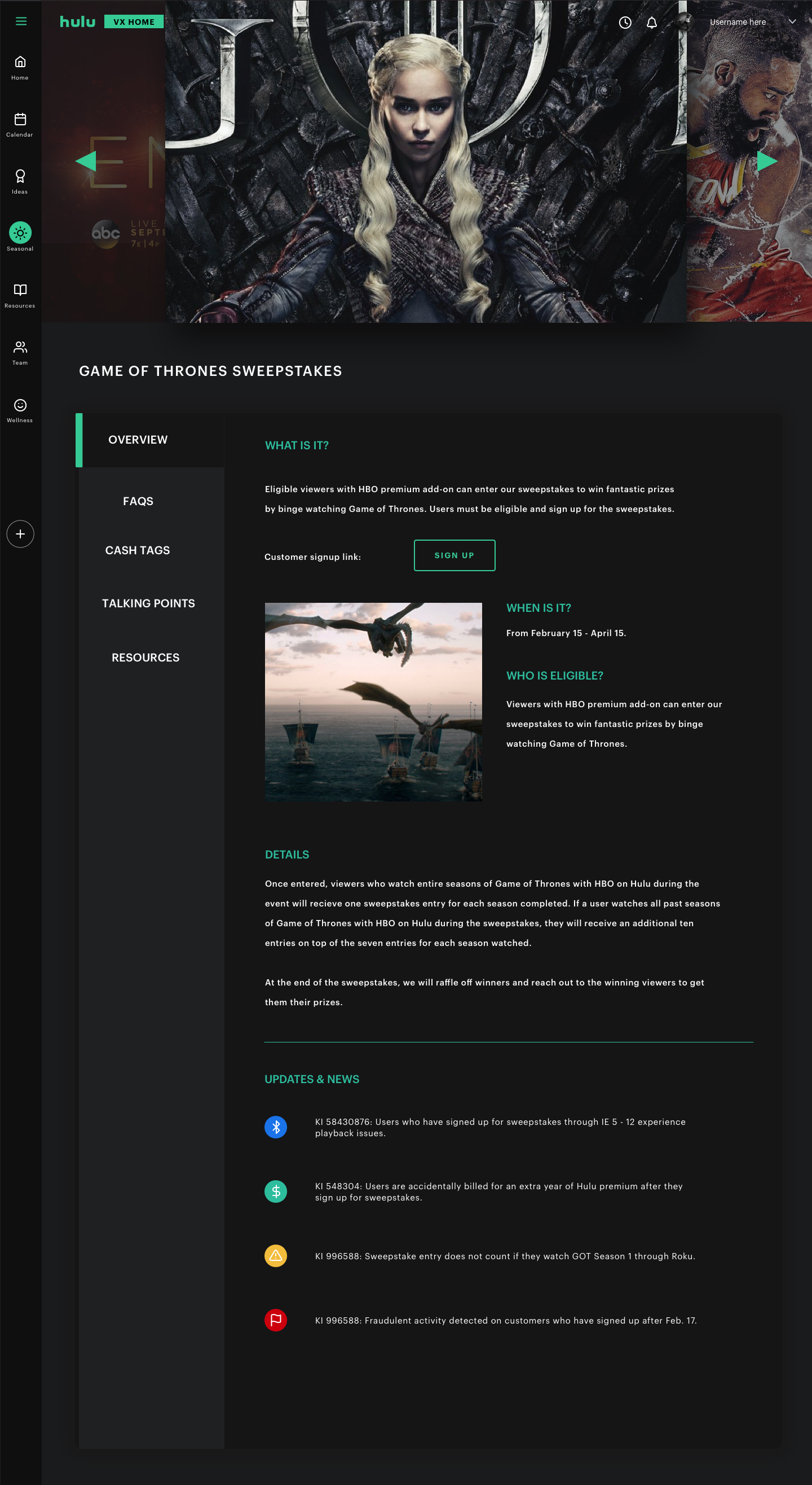
Homepage
VX Home helps agents stay focused by reducing visual clutter and using images to break up text, making info easier to read and understand. The dark theme meets accessibility standards and highlights content, fitting Hulu’s entertainment style. Hulu’s content is presented clearly and fits the brand.
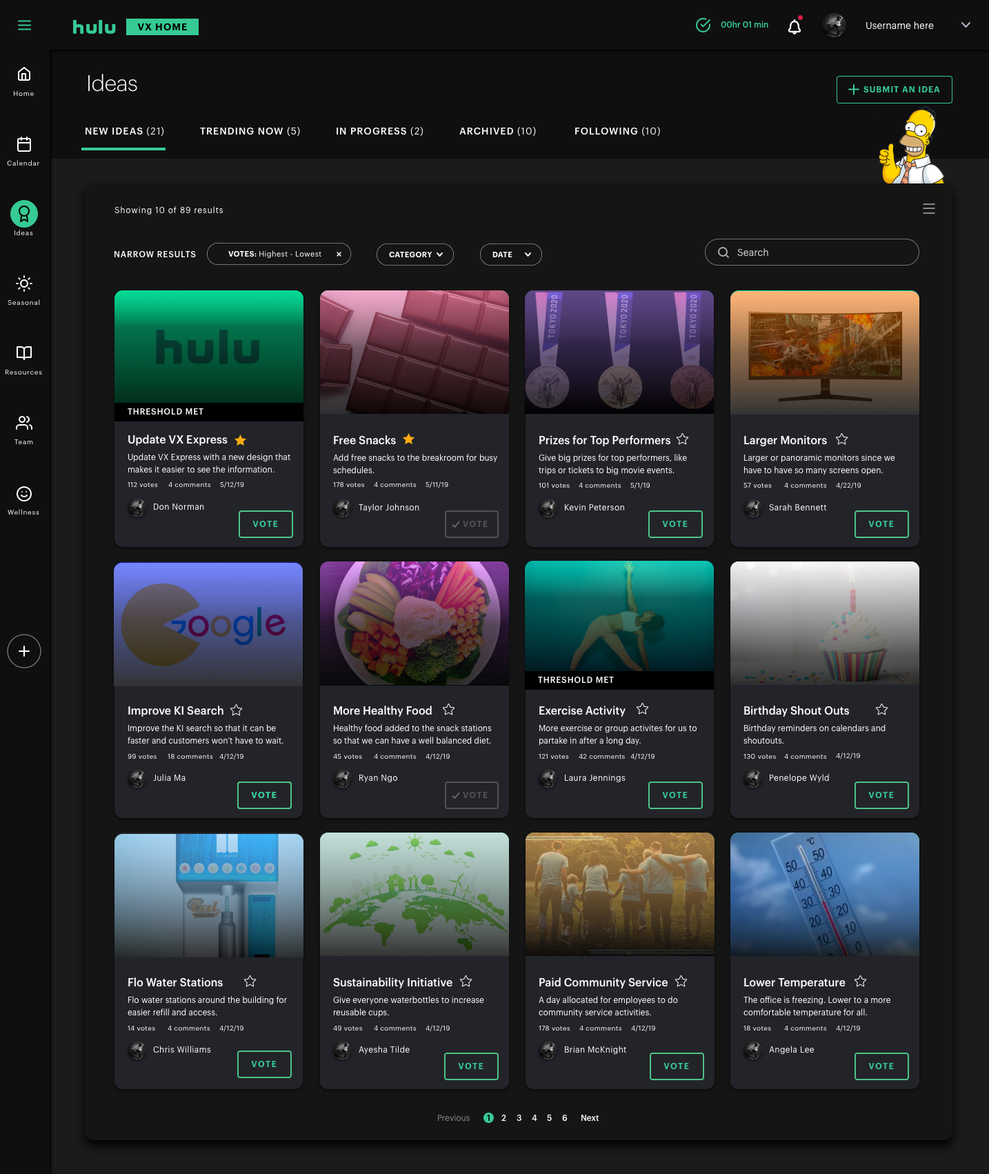
Ideas
Agents can share ideas to improve customer service or the workplace. Others can link to, upvote, and comment on these ideas. Popular ideas may be chosen for development. This supports VX Home’s goal of promoting teamwork and active participation.
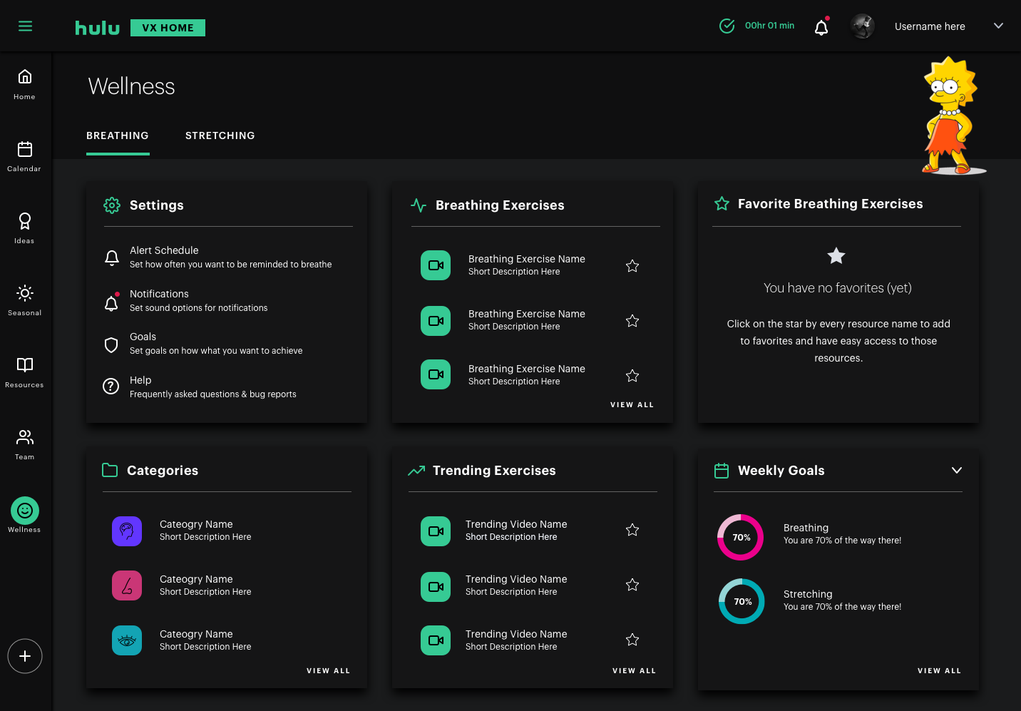
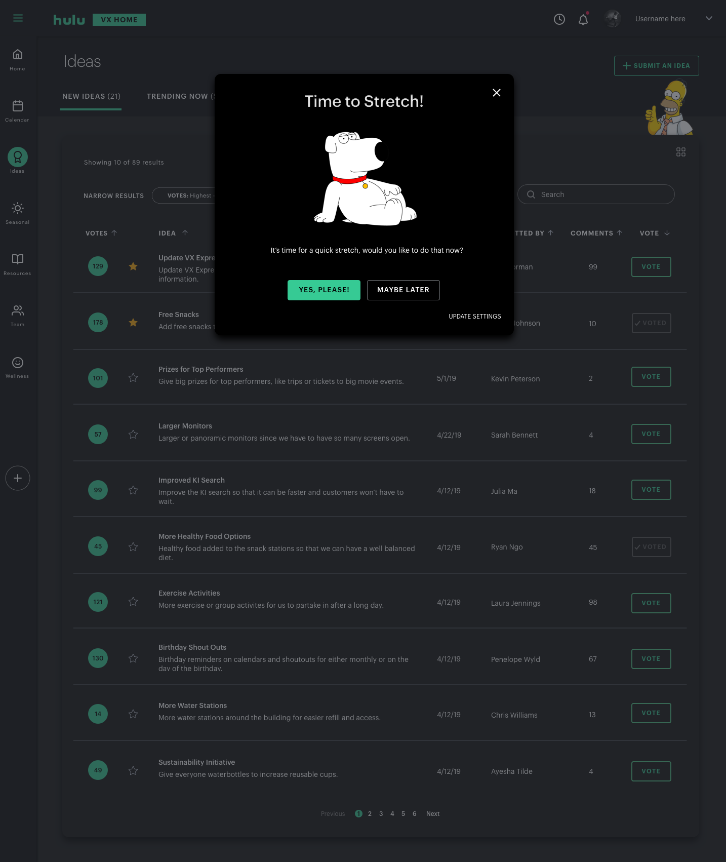
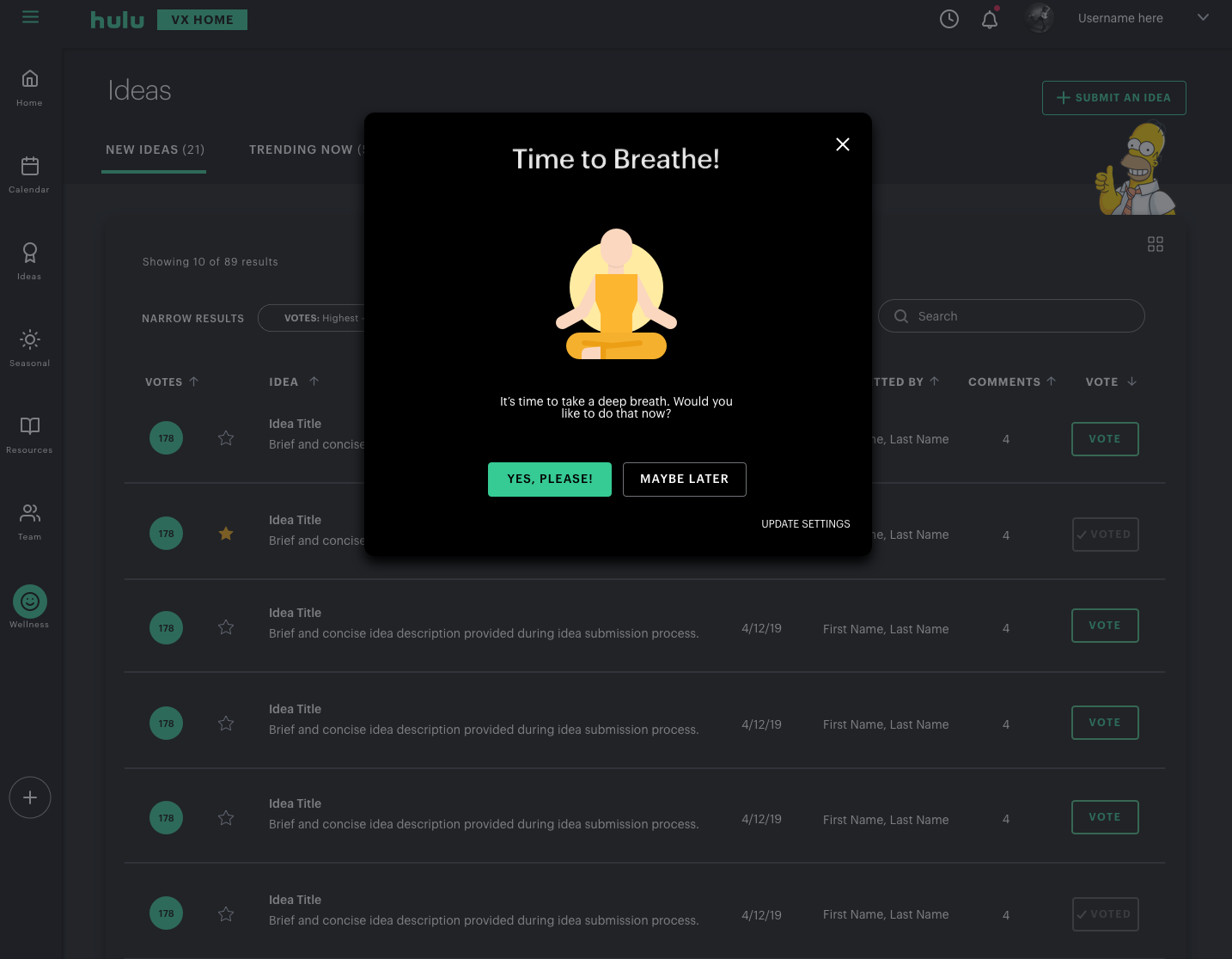
Wellness
The wellness feature is key to supporting the “Whole Human” approach.
It helps agents during their shifts by reminding them to do breathing or stretching exercises. Breathing supports their emotional well-being, while stretching helps physically. Both enhance the experience for VXAs and Hulu customers.

Seasonal
Temporary info like show premieres or sports seasons is now all in one place. It’s organized so agents can quickly find what they need while helping customers.
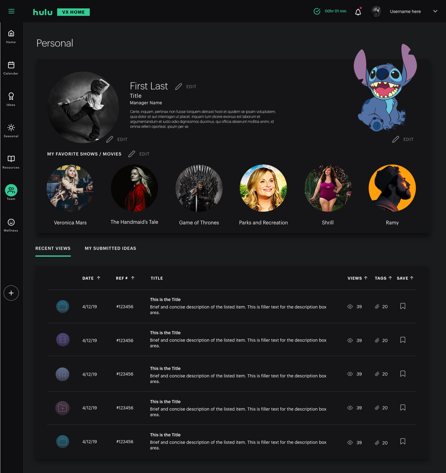
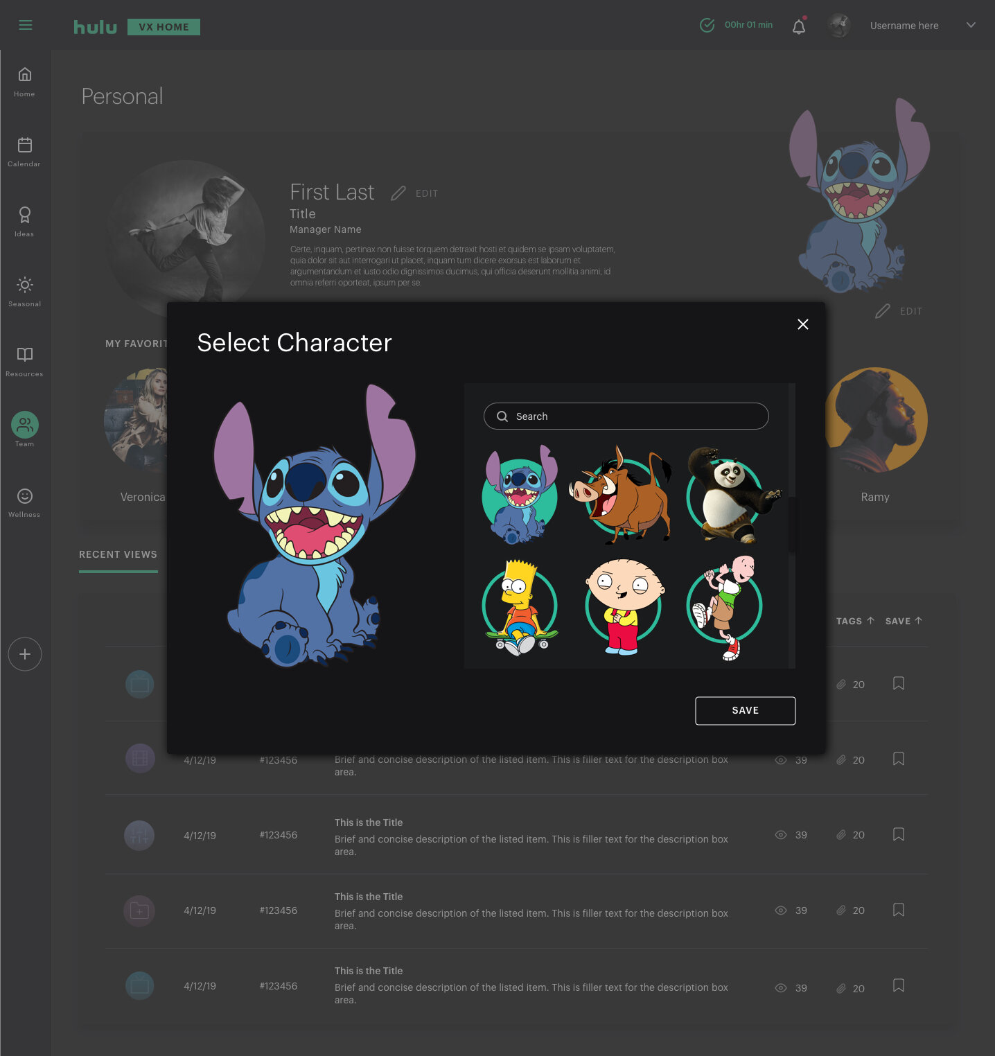
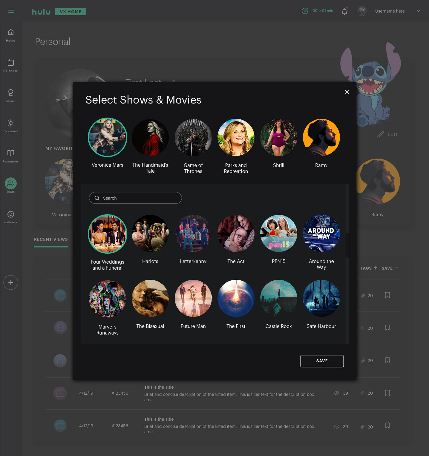
Personal
All user-specific info, like recent page views and submitted ideas, is now in one place. Users can also customize their profile and enjoy one of Hulu’s core values: “embrace fun.”

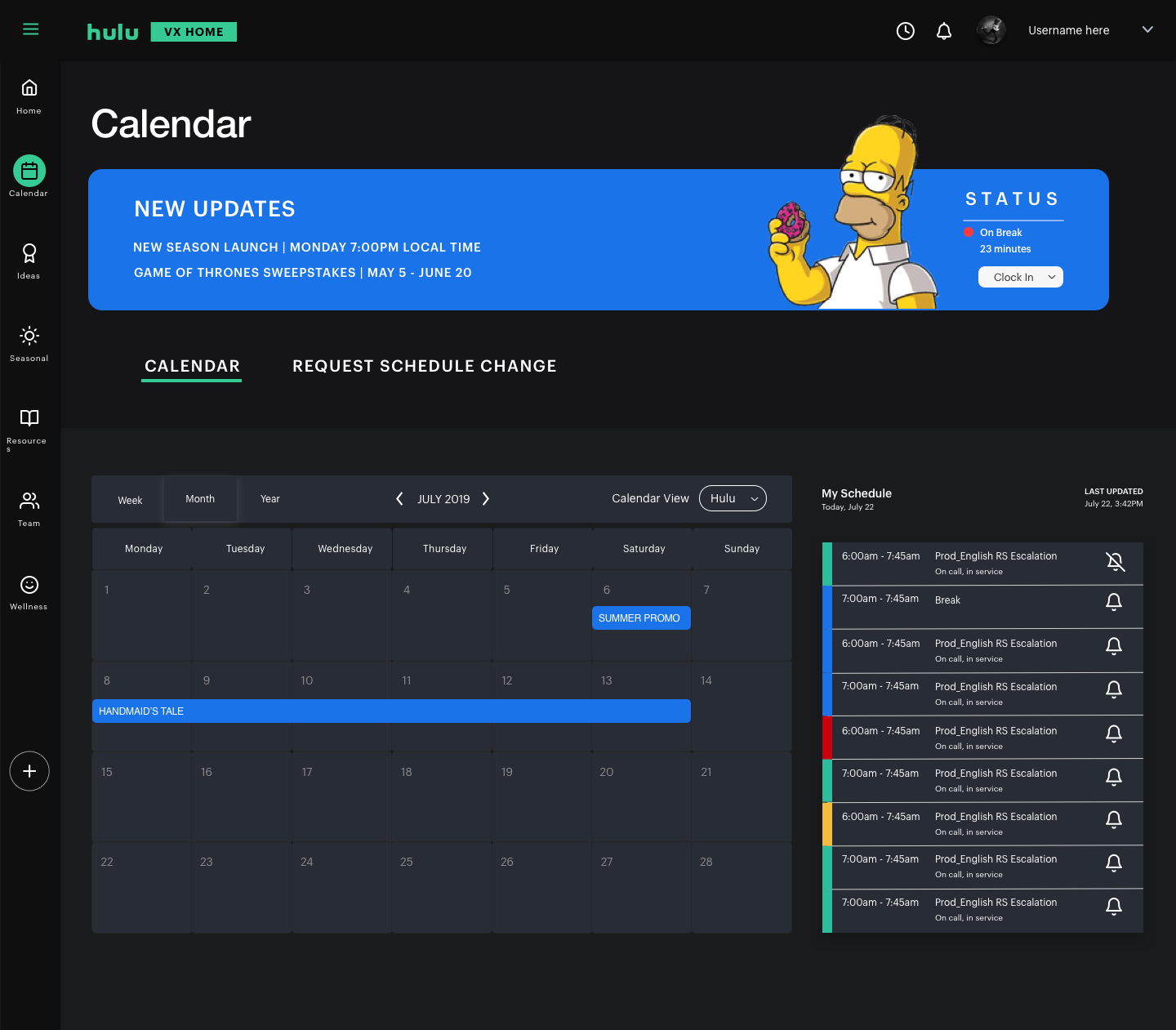
Calendar
The all-in-one calendar lets you clock in and out, view your personalized daily schedule, and sync with Google Calendar.
The Process
We followed the Double Diamond method, a framework that guides the team through understanding user needs and creating effective solutions. By moving through the Discover, Define, Develop, and Deliver phases, we explored the problem space, identified key user challenges, and designed targeted solutions to improve the overall user experience.
Our Method

Discover
Survey, research, interviews, literature reviews, mind mapping, problem statement

Define
Design sprint, concept testing, field testing, user flows, mood boards, low-fi prototypes

Develop
Mid-fi prototypes, stakeholder reviews, user walkthrough, hi-fi prototypes

Deliver
Dev. reviews, de-scope wireframes, dev. asset prep, asset hand-off
Understanding Our Users

Hulu’s support team includes 400 full-time Viewer Experience Advocates (VXAs) and 600 temporary staff who assist during high-demand periods.
To better understand VXAs, we conducted five interviews to:
Build empathy
Understand them as individuals
Explore their daily experiences
These insights led to the creation of a representative persona, Wholesome Wesley.
Our research identified VXAs as frontline workers who perform emotional labor—managing emotions to ensure positive customer interactions. This reinforced the need to design VX Home with a “whole human” approach that supports how people think, learn, and feel at work.
Understanding the Problem Space
One of our affinity diagrams. Pink represents what people liked, blue what people didn’t like, and green represents ideas participants gave us.
We analyzed our research and held brainstorming sessions to better understand the problem space. Through affinity mapping, we identified three key themes in the current VXA workflow:
Too many separate tools
Multiple communication channels
Information scattered across various sources
This created a complex system where agents had to juggle different technologies, channels, and types of information—all serving different purposes. While VX Express was introduced to address these issues, it wasn’t widely adopted or used as intended.
Designing for the Whole Human
Being and staying in control

Emotional and physical wellness

Personal growth

Our goal was to improve customer service by putting employees first. Research showed that supporting frontline workers leads to higher customer satisfaction.
This inspired our design approach: Whole Human Productivity—a new take on productivity that goes beyond efficiency and metrics. It supports how agents think, learn, and feel, helping them stay in control, manage well-being, and grow personally through built-in wellness features.
Brainstorming
Crazy 8’s
During a “Crazy 8” brainstorming session focused on reducing agent overload, we generated and refined ideas to shape our design and development framework.
Key concepts included various KI solutions, centralized portals, improved search, personalized rewards, growth and development tools, user management, and wellness features.
Low-fidelity Concepts
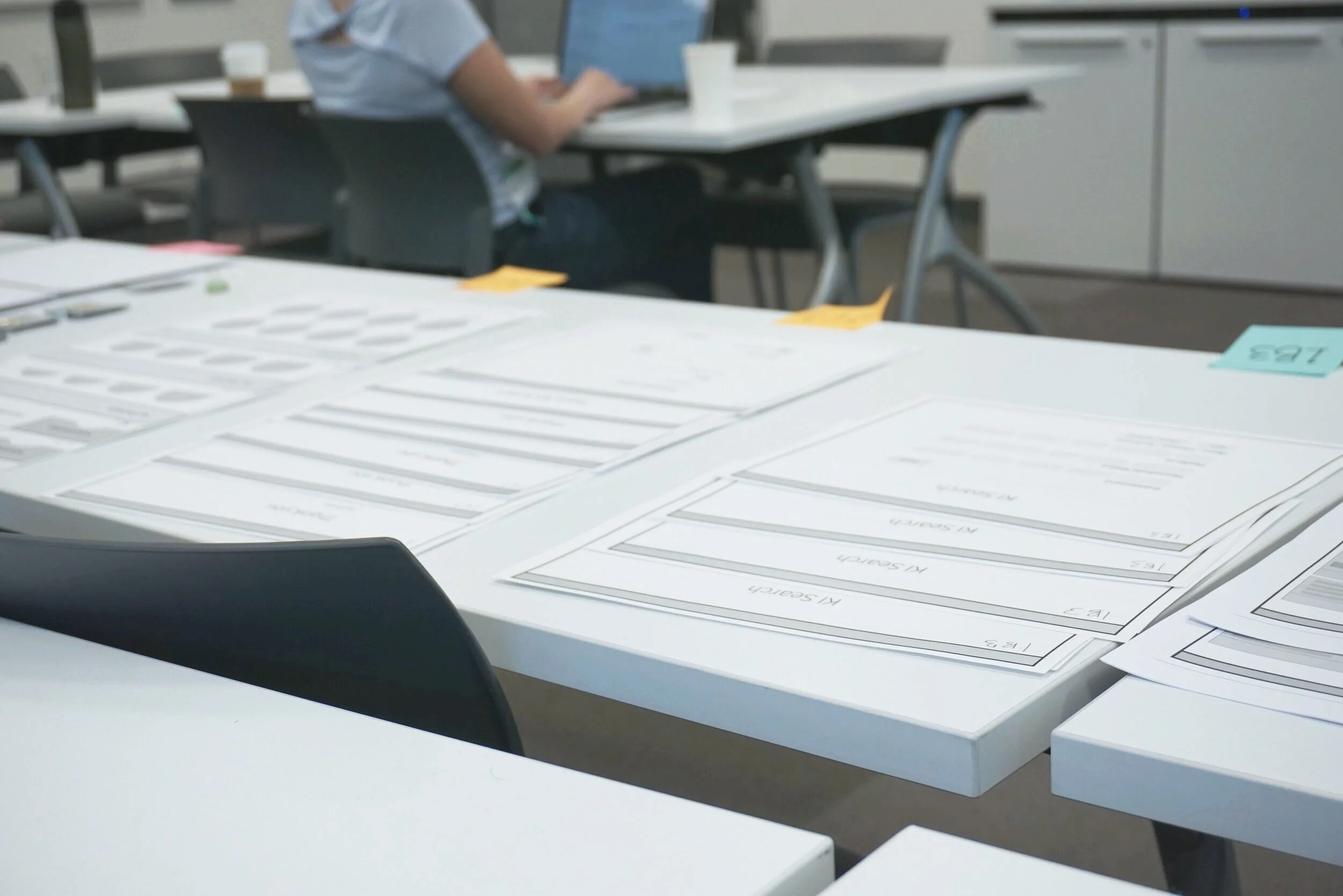
The results of our Crazy 8 brainstorm turned into low-fidelity concepts to test during our in-person concept testing.
Concept Testing
Our team conducted in-person interviews to find out which concepts were most useful. Each 60-minute session included three main activities:
Testing ideas using low-fidelity screens
Sorting both new and existing concepts into categories
Walking through a typical day and mapping when and how each concept would be used
The feedback was valuable—some ideas stood out as clear winners, while others didn’t resonate.
Information Architecture and User Flows
We built the VX Home information architecture through an iterative process. Concept testing played a key role in shaping the structure and user flows. Based on that feedback, we refined the design and moved on to higher-fidelity prototypes.
The information architecture
Two user flow examples
Mid-Fidelity Prototypes
After finalizing the user flows, we created mid-fidelity wireframes to show key information and interactions clearly.
These wireframes were crucial for validating layout, functionality, and user flow early in the design process without getting distracted by visual details.
Working closely with Hulu’s product team and stakeholders helped us to:
Balance feedback and requirements
Spot missing pieces and edge cases
Keep a shared vision for the final product
The Results
Final testing verified that VX Home resonated strongly with both stakeholders and VXAs.

5 out of 5
VXAs who tested VX Home reported it was better than VX Express
What People Are Saying
“With this tool, I could survive a day on the floor and I like that.”
— Viewer Experience Advocate
“It’s beautiful! I think it puts value on personal contribution and leads to more engagement with each other.”
— Viewer Experience Advocate
“It’s very useful, collects a bunch of tools we need, ability to be a one stop shop...all the information is there, it’s convenient!”
— Viewer Experience Advocate

Thank you!
Thank you to my team and everyone at Hulu we worked with, without whom none of this would have been possible!
To watch the full presentation click here